Vision Board Layout
Vision Board Layout
Six layouts, what each one is good at, and the one placement rule that matters more than any of them.
The best vision board layout depends on your goals. A three by three grid keeps things clear, zones group goals by life area, a timeline spreads goals across a year, and a collage feels expressive. Whatever you choose, put your most important goal where your eye lands first and leave some white space.
Nobody talks about vision board layout, and yet it quietly decides whether you actually look at your board. A cluttered board is one your eyes skip over. A clear one pulls you in. Here are the six layouts I use, what each one is good at, and the single placement rule that matters most.
What is the best vision board layout?
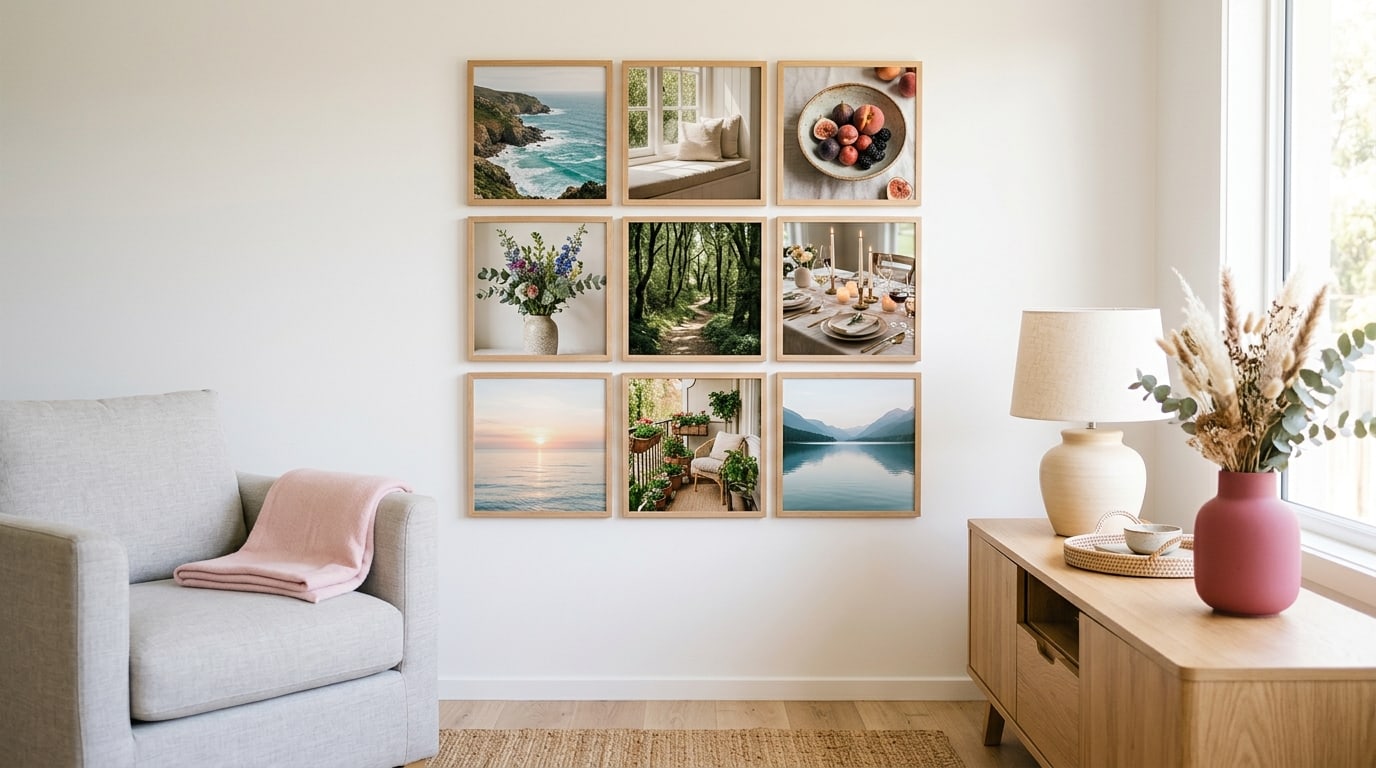
For most people, a simple grid. One goal per square, three by three, with a little space between. It reads at a glance, it is easy to update, and it forces you to limit yourself to nine goals at most. Designers have long used a grid to make pages feel calm and ordered, and the same principle works on a board. If you want something more expressive, the other five layouts below each have their moment.

What are the six main vision board layouts?
- The grid. Nine squares, one goal each. Clear, calm and easy to change.
- Zones. The board split into areas of life, such as work, home and health, with a few images in each. Good for balance. My guide to vision board categories helps you choose the zones.
- Centre focus. One big image in the middle for your main goal, with smaller supporting images around it.
- Timeline. Goals arranged left to right across the year, from early goals to later ones.
- Collage. Overlapping images, textures and words, loose and expressive. Beautiful, but harder to read. See my vision board collage ideas for doing it well.
- Words on top. A word of the year or a short phrase across the top, with images below.
Where should your most important goal go?
Where your eye lands first. On most boards that is the centre or the top left, because that is where people tend to start looking. Photographers use the rule of thirds to place the subject where the eye naturally settles, and you can borrow the same idea: put your main goal on one of those strong points, and let the less urgent goals sit around it.

How much white space should a vision board have?
More than you think. A little space around each image lets it breathe and makes the whole board easier to read from across the room. A crowded board looks energetic in a photo, but it tires the eye day to day. If you are tempted to fill every gap, that is usually a sign there are too many goals rather than too few images.
What is the most common vision board layout mistake?
Treating every goal as equally important. When every image is the same size and fighting for the same space, nothing stands out, and your eye slides across the board without landing anywhere. Give your main goal more room, a bigger image or the centre square, and let the others support it. A board with one clear focus is far easier to read than one that shouts about everything at once.
How do you choose a layout for your goals?
Match the layout to the job. Many small goals across life: the grid or zones. One goal that matters more than everything: centre focus. A year you want to plan: the timeline. A creative mood you want to capture: collage. A theme you want to live by: words on top. If you are not sure, start with the grid, since it is the easiest to change later. A blank vision board template gives you a clean starting grid.
What vision board layout works on a phone?
A tall one. Phone screens are roughly nine by sixteen, so a three by three grid often squashes; two columns of three or four images works better. Keep the top quarter clear if your lock screen shows a clock there, and put your main goal just below it, where your eye goes after checking the time. Captions need to be short, because they will be small. If you want the same board on your wall and your phone, make the wall version first, then rearrange the same images into a tall layout for the screen.
How do you keep a layout working over time?
Leave one square free for new goals, swap images as goals are reached, and track the small habits behind each goal somewhere else, such as a habit tracker for your vision board, so the board itself stays clean. A good layout is one you can keep updating without starting from scratch.
Keep reading
Vision board layout: your questions
For most people, the best vision board layout is a simple three by three grid, with one goal per square and some space between. It reads at a glance, is easy to update and naturally limits you to nine goals, which keeps the board focused and easy to act on.
Place your main goal where your eye lands first, usually the centre or the top left of the vision board. Borrowing the rule of thirds from photography, putting it on one of those strong points helps it stand out every time you look at the board.
Six to nine images suits most vision board layouts. That is enough to cover a few life areas and few enough that each image gets attention. If you have more, choose a zone or timeline layout, or keep extras in a folder for later.
A zone vision board layout divides the board into areas of life, such as work, home and health, with a few images in each. It helps you keep a balance between areas and makes it easy to see at a glance which parts of life have the most attention.
A timeline vision board layout arranges goals from left to right across a period, such as a year, with early goals on the left and later ones on the right. It suits year boards and helps you see what should be happening next.
A collage vision board layout can be beautiful and expressive, but overlapping images are harder to read at a glance. If you choose a collage, keep your main goal large and clear, and leave a little white space so the board does not tire the eye.
Yes. A grid layout is the easiest to change, since you can swap images square by square. Leaving one square free for new goals makes updates simpler, and a digital vision board lets you try several layouts before settling on one.
Keep your vision board alive
A board built in your browser resets when you close the tab. Vision Boardly saves your boards, reminds you as each vision date arrives, and tracks the habits and moods moving you toward them.
Get Vision Boardly Free