Pink Vision Board Ideas
Pink is a colour for anyone. Choose your shade, pair it well and let it carry every goal on the board.
Pink vision board ideas start with choosing your shade: blush for calm, rose for warmth, coral for energy, hot pink for boldness, dusty pink for a vintage feel or berry for depth. Pair it with one neutral and one contrast colour, choose pink images for each goal and keep captions dark and readable.
Pink is having a long moment, and I understand why. It can be soft or loud, nostalgic or modern, and it makes almost any image feel warmer. These pink vision board ideas are for anyone who loves the colour, whatever your style and whoever you are. Pink is not a mood, it is a whole family of moods, so the first step is choosing yours.
What are the best pink vision board ideas?
The best pink boards do three things well. They choose one main shade rather than every pink at once. They pair it with colours that let it shine. And they keep the goals readable, so the board works as well as it looks. Get those three right and the details almost take care of themselves.
Which shade of pink suits your board?
Blush is pale and soft, ideal for a calm year or a board about rest. Rose is warm and romantic, lovely for boards about love, home and friendship. Coral leans toward orange and brings energy, good for movement and adventure. Hot pink is bold and confident, for a year when you want to be seen. Dusty pink has a little grey in it and feels vintage and grown up. Berry is deep and rich, with a sense of depth and seriousness.
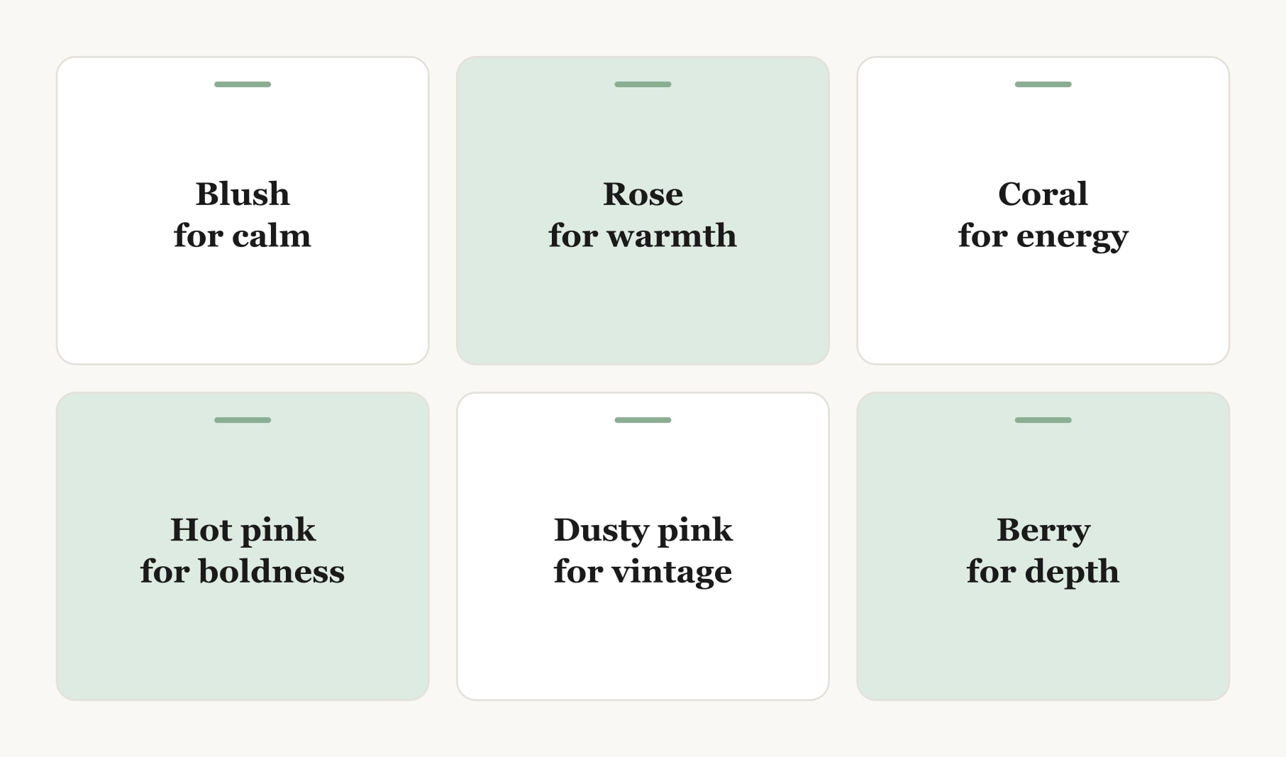
If you cannot choose, ask what you want this year to feel like. The shade usually follows.
Which colours pair well with pink?
Use a simple formula: pink, one neutral and one contrast colour. Blush with cream and sage green feels fresh. Rose with white and gold feels warm. Coral with sand and deep teal feels sunny. Hot pink with white and black feels graphic and modern. Dusty pink with grey and navy feels calm and tailored. Berry with cream and forest green feels rich. Green is a natural partner for almost every pink, which is why so many pink rooms have plants in them.
Which pink images suit each goal?
- Career: a pink notebook on a tidy desk, or a coral sunrise through an office window.
- Movement: a pink sky over a running path, or a pink yoga mat in morning light.
- Home: a rose throw on a sofa, a pink front door or a dusty pink bedroom wall.
- Travel: cherry blossom on a city street, a pink sunset over the sea or a pastel harbour town.
- Saving: a pink jar slowly filling with coins for something you will enjoy.
- Rest: pink peonies by a bed, or a bath in soft evening light.
How do you keep a pink board easy to read?
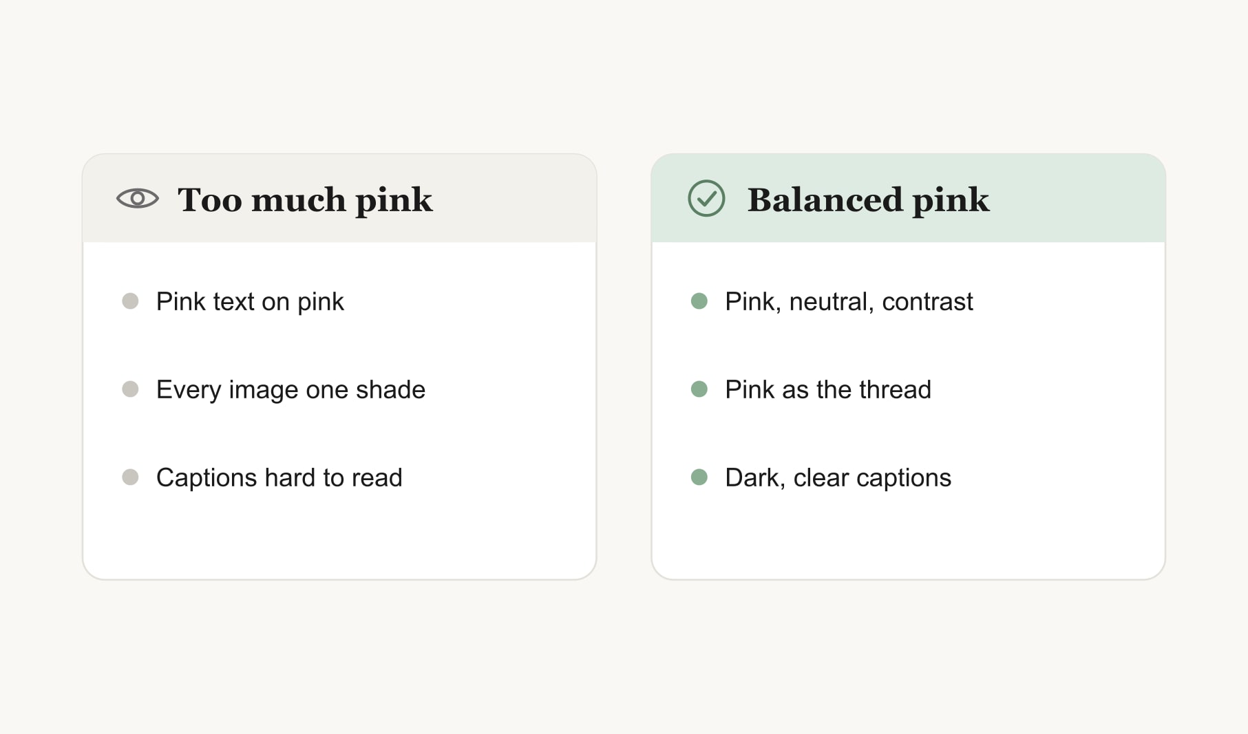
Keep captions dark. Pink text on a pink background disappears, so use charcoal, navy or deep berry for words. Give each image a thin white border so it stands apart from a pink background. Mix pink images with a few that are mostly neutral, so the eye has somewhere to rest. And let pink be the thread rather than the whole fabric: a pink background, pink date chips or pink pins tie everything together without overwhelming the goals.
Can a pink board feel minimal or bold?
Both. For a minimal pink board, use a white background, blush accents and lots of space, with photos in soft, faded tones. The aesthetic vision board is a good starting point for this look. For a bold pink board, use a hot pink background, black and white photos and one bright image as the focal point. Same colour, completely different feeling.
How do you make a pink digital board?
A pink board looks lovely on a phone. Choose one shade for the background and keep images in matching tones. Leave the top of the screen clear for the clock. The vision board wallpaper builder turns your board into a lock screen, so your pink goals greet you every time you pick up your phone.
Which pink accents work on a mostly neutral board?
If a fully pink board feels like too much, use pink only in small places. Pink pins or washi tape at the corners. A pink date chip under each image. One pink photo as the focal point, with every other image in calm neutrals. A pink frame around a white board. A single word in rose lettering across the top. These small touches let you enjoy the colour every day while the board itself stays quiet and easy to read. They also make a pink board easy to refresh later, since you can change the accents without rebuilding the whole thing.
Does pink suit a self-care board?
Beautifully. Soft pinks feel restful, which makes them a natural choice for a board about rest, routines and kindness to yourself. Pair blush with cream, add images of slow mornings and quiet evenings, and the self-care vision board does the rest. To notice how the colours and goals make you feel over time, a mood tracker for your vision board takes a few seconds a day.
What does a finished pink board look like?
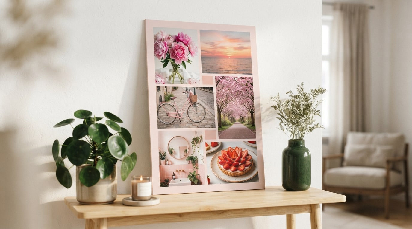
Picture a blush background on a light wooden shelf. Six photos with thin white borders: peonies in a jar for “slow Sunday mornings”, a sunset over the sea for “a week by the coast”, a pink bicycle for “cycle to work twice a week”, a cherry blossom path for “a spring trip to a new city”, a pink-tiled bathroom for “finish the bathroom” and a strawberry tart for “bake something every month”. Charcoal captions, rose date chips and a green plant beside the board. Calm, warm and unmistakably pink.
Keep reading
Pink vision board ideas: your questions
Pink vision board ideas include choosing one shade such as blush, rose, coral, hot pink, dusty pink or berry, pairing it with a neutral and a contrast colour, and picking pink images for each goal, such as cherry blossom for travel or peonies for rest.
On a vision board, pink pairs well with one neutral and one contrast colour. Blush suits cream and sage green, rose suits white and gold, coral suits sand and teal, and hot pink suits white and black. Green partners well with almost every shade of pink.
Keep a pink vision board readable with dark captions in charcoal, navy or deep berry, thin white borders around each image and a few mostly neutral photos. Use pink as the thread that ties the board together rather than covering every surface.
Yes, a pink vision board can look minimal. Use a white background, soft blush accents, plenty of empty space and photos in faded, gentle tones. Keep captions short and dark, and limit the board to five or six goals for a calm, uncluttered finish.
On a vision board, blush suggests calm, rose suggests warmth and love, coral suggests energy, hot pink suggests boldness, dusty pink feels vintage and grown up, and berry suggests depth. Choose the shade that matches how you want the year to feel.
No, a pink vision board suits anyone who loves the colour. Pink ranges from soft blush to bold hot pink and deep berry, so it fits minimal, vintage, graphic and cosy styles alike. Choose the shade and pairing that feel right for your goals.
Keep your vision board alive
A board built in your browser resets when you close the tab. Vision Boardly saves your boards, reminds you as each vision date arrives, and tracks the habits and moods moving you toward them.
Get Vision Boardly Free